


How do I use the U.S. Climate Vulnerability Index?
Learn more about how to use the CVI in this section.
CVI Features
Exploring the U.S. Climate Vulnerability Index
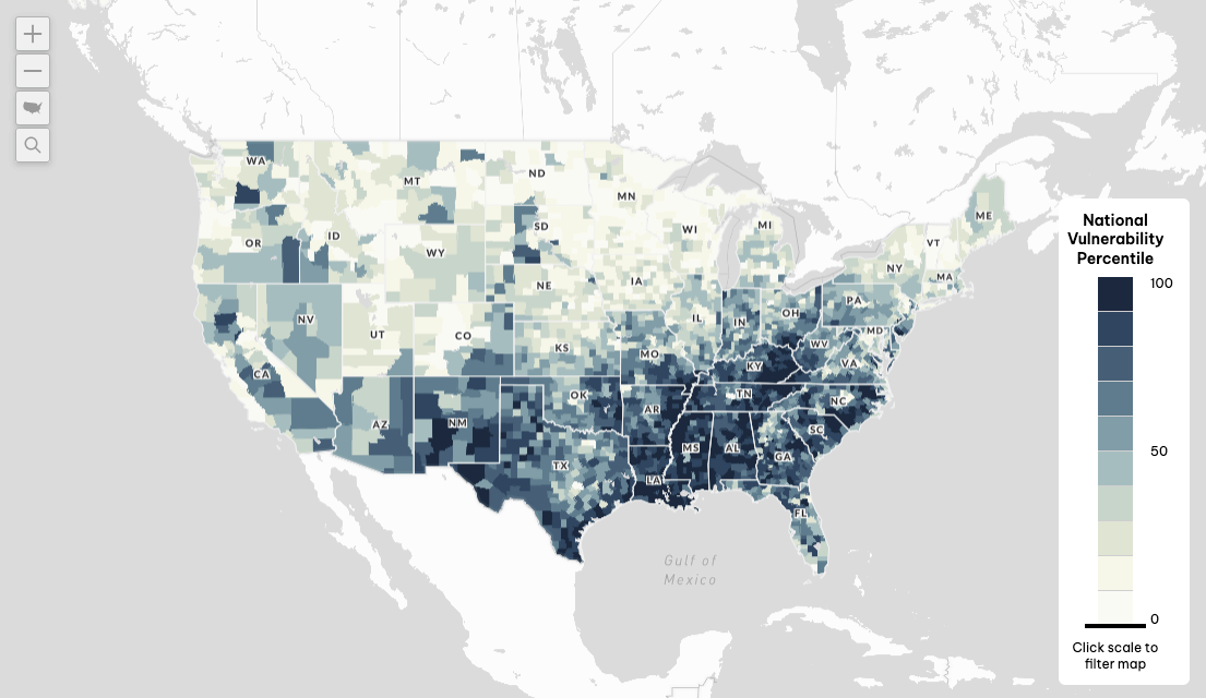
The Map
The main CVI screen starts with a national visualization of Overall Climate Vulnerability data, with the option to select the underlying themes, domains, subdomains, and indicators.
You can zoom and pan to different locations in the interactive map as well as search for locations.
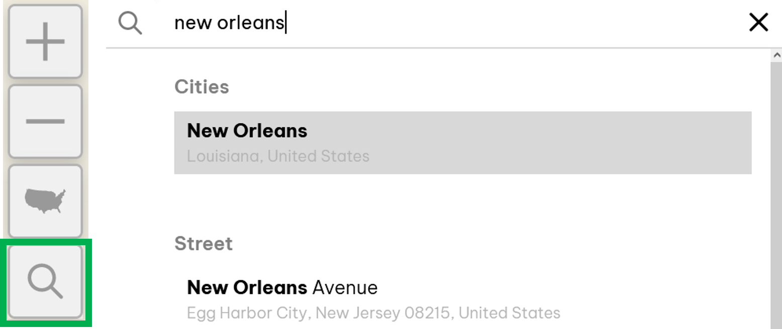
Location Search
You can type in an address to see data at a specific location or just enter the CVI to explore it.
You can use the location search function to explore data at any of the following types of locations:
- Address
- Street
- Neighborhood
- Zip Code
- City
- State
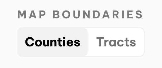
Map Boundaries
The top right side of the CVI allows you to toggle between viewing counties or census tracts. Census tracts are smaller geographies with fewer people, which are more relevant for frontline advocacy work.
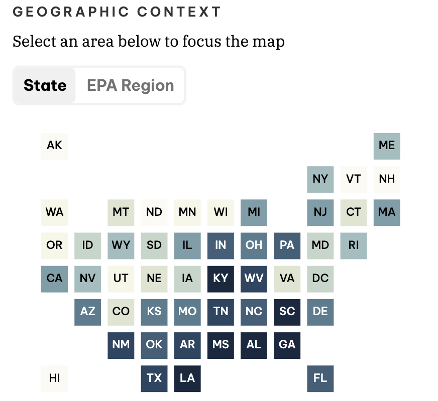
Geographic Context
The bottom right side of the CVI allows you to toggle the geographic context of the map, whether you would like to see the data at the state level or the EPA region scale.
Data Levels
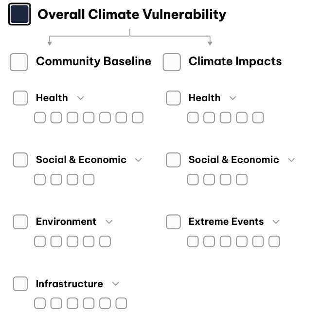
The CVI contains data divided into Community Baseline and Climate Impacts themes, which detail factors and conditions within a community that can limit its resilience to climate challenges and risks. Viewed together, these themes show a community’s cumulative climate vulnerability.
The CVI data has 5 levels, which we learned about in Step 2.
You can click on any of the data indicators and explore the map under this data layer.

Report Generation
After you select a geography, you can click the “View Report” box on the bottom right. When you click “View Report”, you will be brought to a new page that displays the data for that location.
CVI Report Features
Exploring and using reports
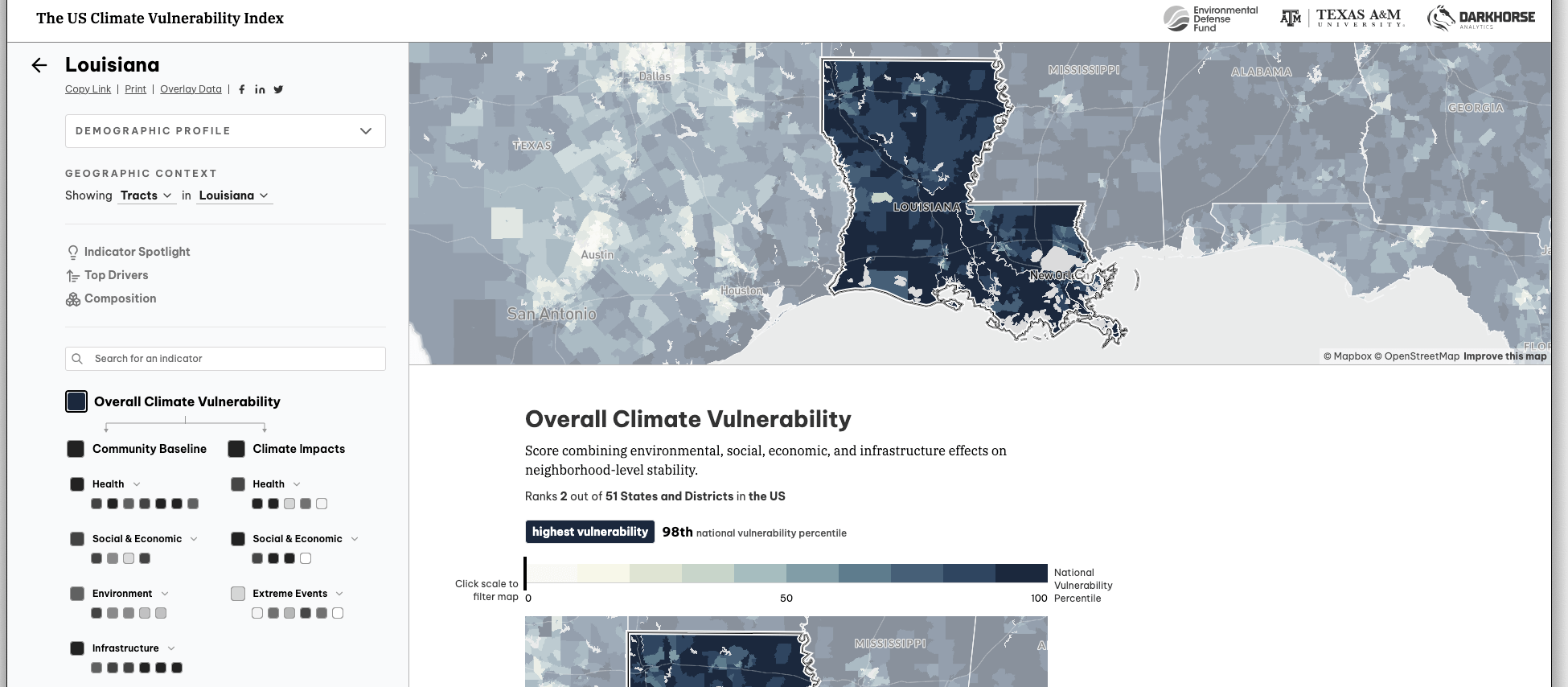
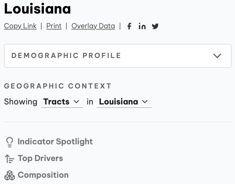
The Report
Each report features a panel on the left side of the screen where you can learn more about a geography’s demographic profile, alter the geographic context, and understand more about specific drivers of vulnerability. On the right hand side of the screen, maps of the census tract/county are accompanied by vulnerability scores, rankings, and a breakdown of what contributes to the overall vulnerability score.
Report Navigation
You can also use the “Print” or “Copy Link” functionality to share your report, along with the social media share buttons.
“Indicator Spotlight”, “Top Drivers”, and “Composition” describe the data visualizations on the right and allow you to navigate to different sections of the report to further investigate your data.
Note: Not all indicators have “Top Drivers” and “Composition” available.
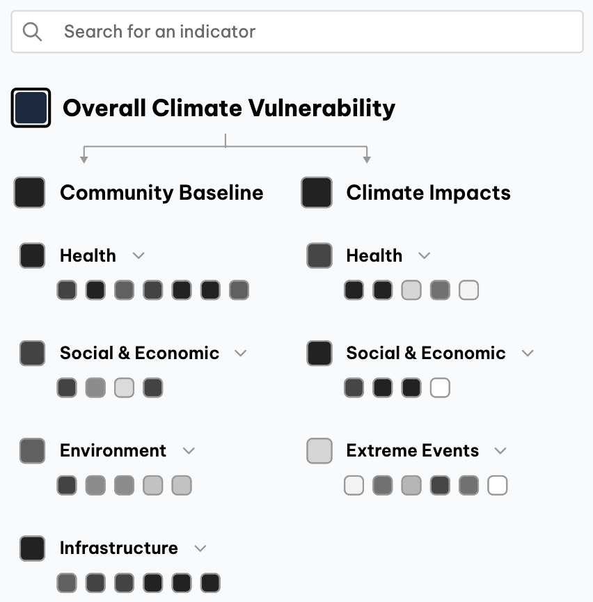
Indicator Tree
You can see data for the location in the categories mentioned in Step 2, and you can search for a specific indicator to view data for your report location.
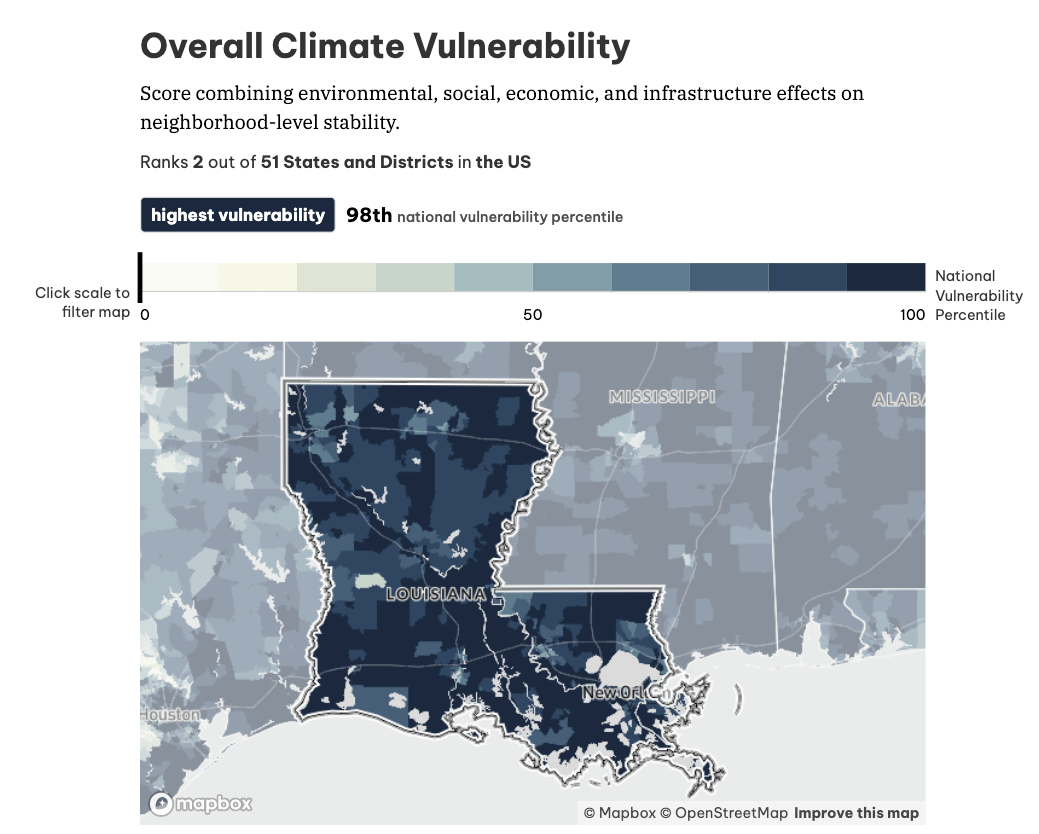
Indicator Spotlight
The first section of the report, called “Indicator Spotlight”, displays the data for your selected indicator. The top area shows the vulnerability rank compared to other locations at the same scale. The higher the national percentile, the higher the vulnerability rating compared to others at the same scale.
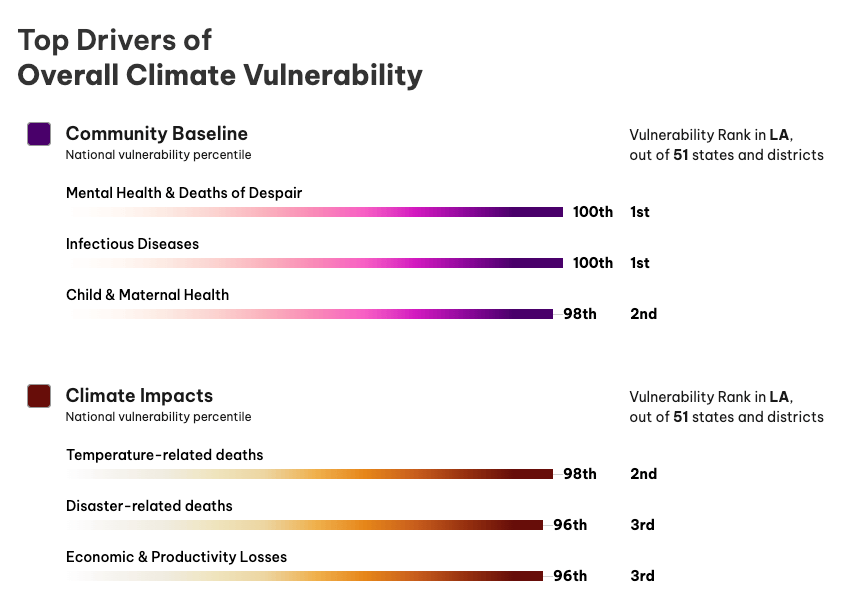
Top Drivers
If you click “Top Drivers” or scroll down the report, you will see a section that says, “Top Drivers of Overall Climate Vulnerability.” This is a summary of what is driving vulnerability at your selected location. Here you can click on each category and be taken to a summary page breaking down the data in greater detail for that category.
Note: Not all indicators have “Top Drivers” and “Composition” available.
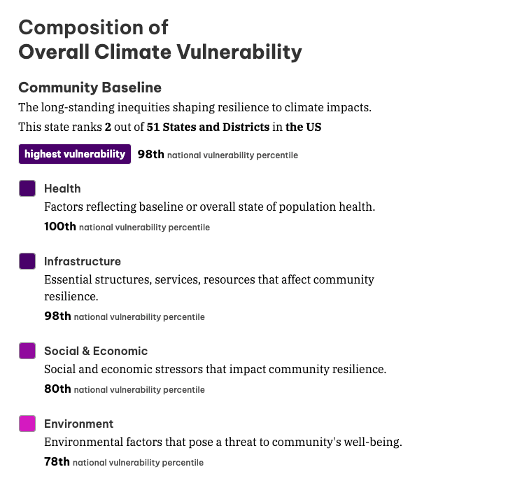
Composition
You can see more information about a data category by selecting “Composition” on the left or continuing to scroll down the report.
Here you will see more information about the data in the selected category in terms of its rank, indicator definition, vulnerability rating, and national percentile. You can click on the indicators listed there to map national percentile, vulnerability rating, and ranking for the specific indicator.
Note: Not all indicators have “Top Drivers” and “Composition” available.


